You spend hours planning a party, buying decorations, and setting everything up perfectly — and then the photos come out looking flat, harsh, or just plain wrong. If this has ever happened to you, the issue probably isn’t your camera. It’s your color palette.
Some colors photograph beautifully while others fight the camera every step of the way. Understanding which colors work well on camera can completely transform how your parties look in photos, on social media, and in the memories you keep for years. This guide breaks down exactly how to pick decor colors that photograph well, which combinations to avoid, and how to make any color palette look intentional and polished on camera.
Why Some Colors Photograph Better Than Others
Before picking colors, it helps to understand why photography treats certain shades differently. Cameras don’t see color the way our eyes do — they respond to light, reflection, and contrast in specific ways that affect how decorations look in final photos.
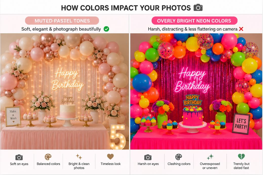
Softer, muted colors like blush pink, cream, sage green, and dusty blue photograph beautifully because they reflect light gently. They don’t create harsh highlights or dark shadows, which means your photos look smooth and balanced. These are the colors you see all over Pinterest wedding boards for a reason.
Highly saturated colors — think bright red, neon green, or electric blue — are much harder to photograph. They can look great in person but often appear over-saturated or unnaturally intense on camera. Skin tones near these colors can also pick up unflattering color casts, making people look flushed or sickly.
Pure white and pure black are tricky too. White reflects too much light and can blow out in photos, while black absorbs light and creates dark voids. Off-white, cream, charcoal, and soft black work much better in photos than their pure counterparts.
Metallic colors — gold, silver, rose gold, chrome — photograph brilliantly because they catch light in dynamic ways. This is why so many modern party setups lean heavily on metallic accents.
Understanding this basic science helps you make smarter color choices before you even buy anything.
Colors That Always Photograph Beautifully
Certain color palettes have become photography staples because they consistently deliver stunning results. If you’re not sure where to start, these are safe bets that always look good on camera.
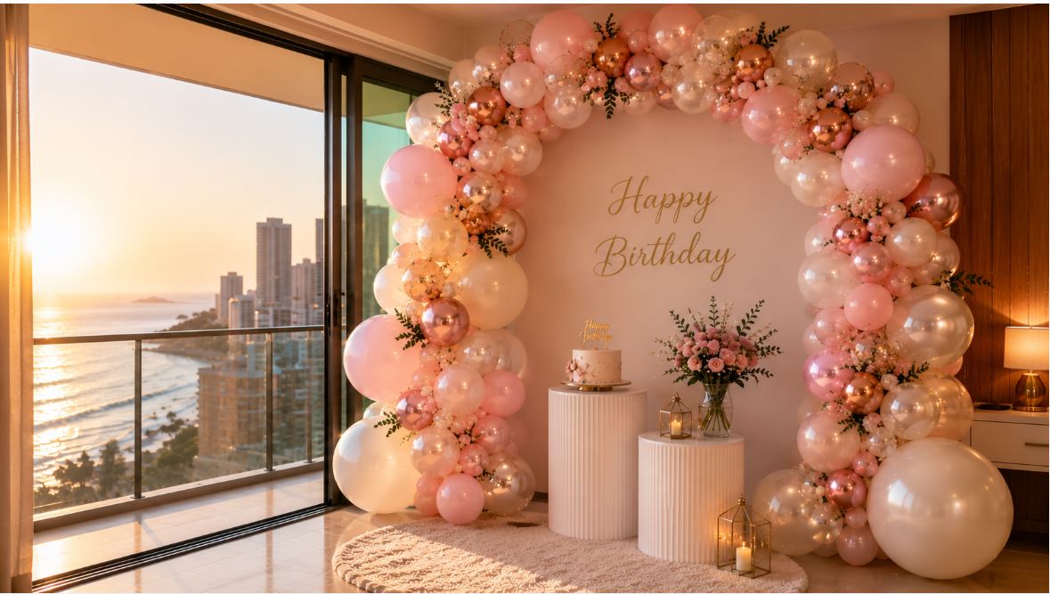
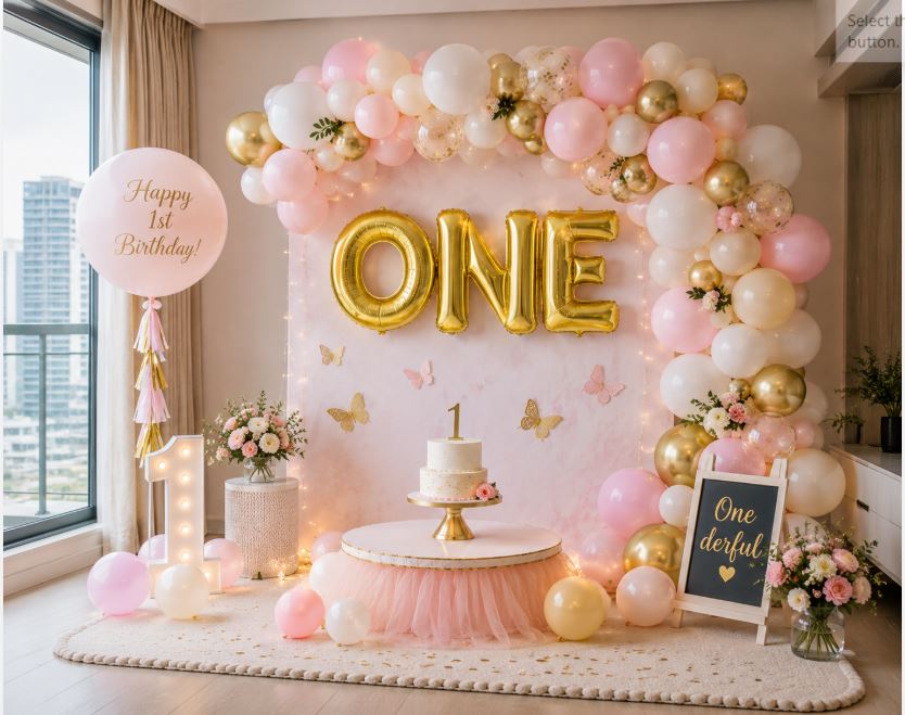
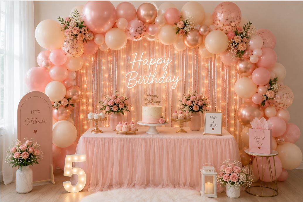
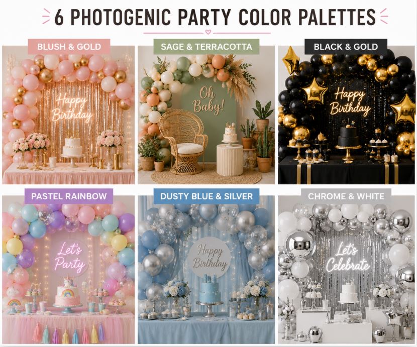
Blush pink and gold is the reigning champion of party photography. The softness of blush flatters skin tones, and gold adds warmth and depth. This palette works for baby showers, weddings, birthdays, engagements — basically anything.
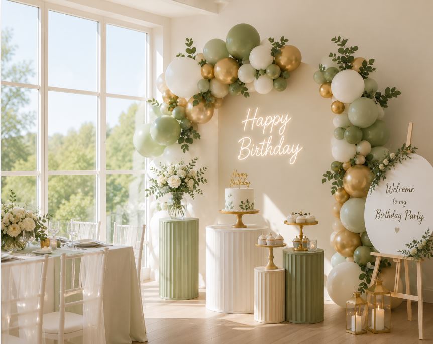
Cream, sage green, and terracotta is another highly photogenic combination that’s gained massive popularity. It feels earthy and modern, and the muted tones photograph beautifully in both natural and warm indoor lighting.
Black, gold, and white creates elegant, high-contrast photos that feel timeless. This palette is great for milestone birthdays, New Year parties, and formal celebrations. The contrast makes photos pop without being overwhelming.
Pastel rainbow combinations — soft pink, mint, lavender, peach — photograph beautifully for kids’ parties and baby showers. The muted versions of these colors avoid the harsh look of primary rainbow shades.
Dusty blue with silver or cream feels calm, elegant, and photographs like a dream. It works especially well for gender reveals, baby showers, and refined adult celebrations.
Chrome silver with white and hints of any accent color creates a modern, glossy aesthetic that photographs incredibly well, especially with good lighting.
Start with one of these tested combinations if you want a foolproof photogenic setup.
Colors and Combinations to Avoid
Just as important as knowing what works is knowing what doesn’t. Some colors and combinations look great in person but consistently produce disappointing photos.
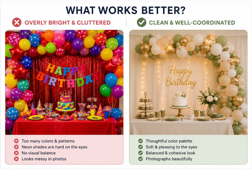
Neon colors are the biggest offenders. Neon pink, neon green, neon orange — they all cause camera sensors to blow out or over-saturate. Photos end up looking amateur, and skin tones near these colors turn strange. Save neon for indoor parties where photos aren’t a priority.
Pure primary red is another tough one. It tends to bleed on camera, creating a harsh, aggressive look. If you want red in your palette, go for burgundy, deep wine, or dusty rose instead — all photograph much better.
Too many colors clashing together is a common mistake. Rainbow-everything setups look chaotic in photos, even when they seemed fun in person. Stick to three colors maximum for the cleanest photographic result.
High-contrast combinations like pure black next to pure white can create harsh shadows on camera, especially in strong lighting. Softening one of the colors (charcoal instead of black, cream instead of white) fixes this.
Very dark themes photograph poorly in low light. Dark purple, deep navy, or all-black setups look moody in person but require strong lighting to photograph well. If your venue has dim lighting, avoid heavy dark palettes.
Also be careful with color casts from lighting. Yellow indoor lights can turn cream decorations orange in photos, and cool white LEDs can make warm colors look flat. Test your setup under the actual event lighting if possible.
The Two-Color Plus Metallic Formula
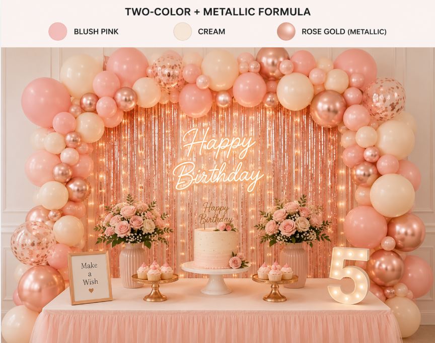
Here’s a formula that works for basically any event: pick two main colors that complement each other, then add a metallic accent. This three-color approach hits the sweet spot between visually interesting and photographically clean.
For example, pick blush pink and cream as your two main colors, then add rose gold as the metallic. The pink and cream provide the base, and the rose gold ties everything together with warm shine. Almost every photo you take will look polished.
Another example: sage green and cream with gold metallic accents. Or dusty blue and white with silver. Or terracotta and cream with brass or bronze. The specific pairings can vary, but the structure stays the same — two soft colors plus one metallic.
The reason this works so well is that it creates natural depth without visual chaos. The two main colors coordinate without competing, and the metallic adds highlights that catch the eye and the camera lens.
Metallic doesn’t have to mean tacky. Modern metallic decor — brushed gold banners, chrome balloons, rose gold cake toppers, silver fairy lights — feels sophisticated when used thoughtfully. The key is treating metallics as accents, not the main event.
If you want a fourth accent color, keep it minimal — a small pop of dark green or deep red among a blush-and-gold setup, for instance. But four colors is generally the maximum before things start looking busy.
Match Colors to the Lighting and Venue
Colors don’t exist in isolation — they interact with lighting and the space around them. A color that looks perfect in one venue can look completely different in another, so factor this in when planning.
Warm indoor lighting (yellow tones, common in most homes) makes cream, blush, gold, and warm neutrals glow beautifully. It’s flattering for people and decorations. But it can turn cool colors like blue or mint slightly greenish in photos.
Cool white lighting (common in newer LED bulbs) works well with modern palettes — chrome, cool pastels, dusty blue, sage green. But it can wash out warm colors like blush pink or gold.
Natural daylight is the most flattering for photos overall. It’s neutral, so almost any color palette photographs true-to-life. If you can time your party for daytime or set up near large windows, you’ll get better photos automatically.
Also consider the wall and floor colors of your venue. A brightly colored wall will fight with your decor. Neutral venues (white, cream, gray walls) let your color palette shine. If your venue has strong existing colors, coordinate your decor with them rather than against them.
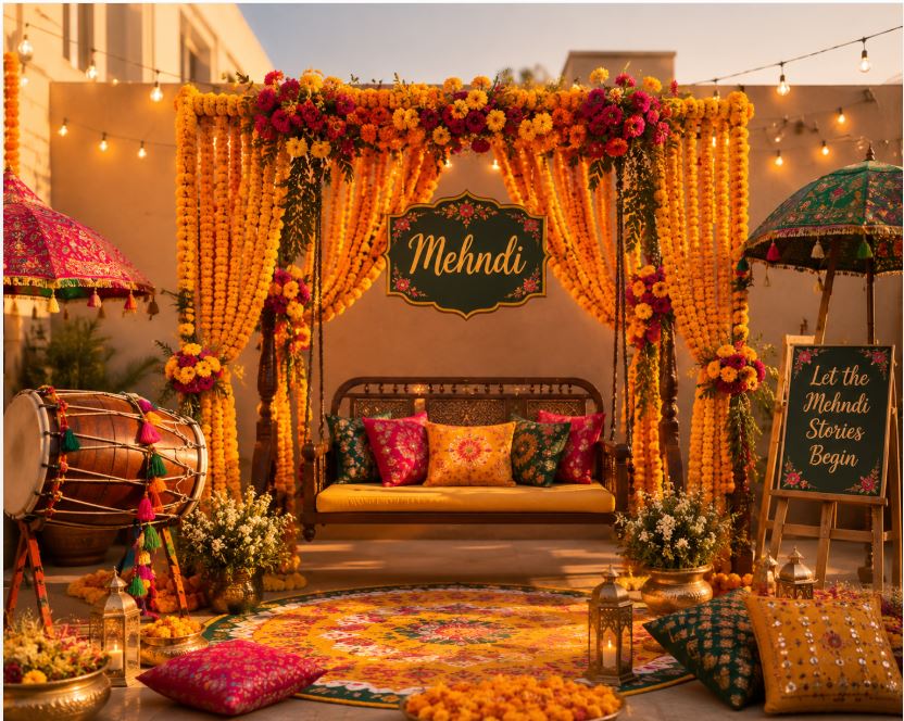
Outdoor parties bring their own challenges — sunlight during the day is bright and unforgiving, so soft muted colors work better than bold ones. Evening outdoor parties benefit from warm string lights and cozy color palettes.
Test your color combination in the actual venue before finalizing purchases if possible. Even snapping a phone photo of a sample balloon or fabric in the space can tell you a lot.
Test Your Palette Before Committing
Before you spend money on a full decoration setup, test your color palette. This one step saves people from expensive mistakes and disappointing results.
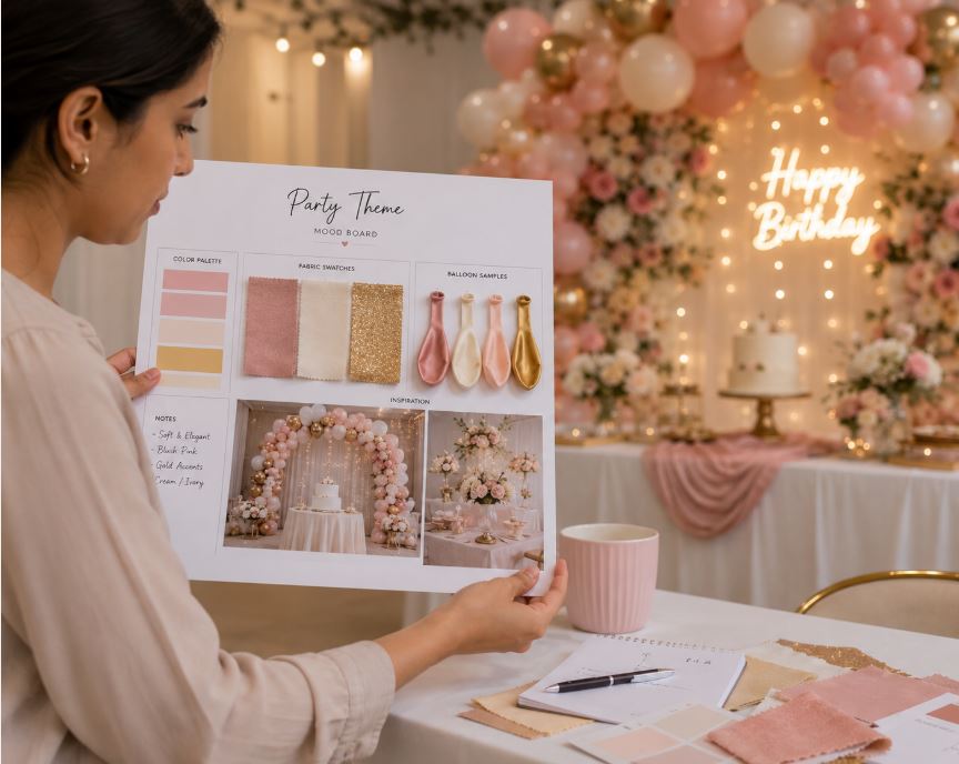
The easiest test is a mood board. Gather color swatches, sample balloons, small fabric pieces, or even printouts of your intended colors. Place them together on a table and photograph them with your phone. This gives you a real preview of how the colors will look on camera.
Better yet, do a mini test setup. Buy one or two balloons in each color you’re considering, along with a small piece of your intended backdrop material. Set them up in the actual venue (or a similar space) and take photos in the lighting you’ll actually have. You’ll know within minutes whether the palette works.
Look at how the colors interact with skin tones by having someone stand near the sample setup. This is especially important for photo booth areas — you want the background to make people look good, not weird.
Take photos with different phones or cameras if possible. Some devices interpret colors slightly differently, so seeing multiple outputs gives you a more balanced idea.
Also check how the colors look on Instagram or social media before finalizing. Colors can shift when uploaded to social platforms, and if that’s where most of your photos will end up, it’s worth checking.
A little testing upfront saves regret later. It’s one of those small habits that separates smooth parties from stressful ones.
Conclusion:
Picking decor colors that photograph beautifully isn’t about luck — it’s about understanding how colors behave on camera and choosing combinations that consistently deliver stunning results. Soft, muted tones photograph better than harsh neons. Two coordinated colors plus a metallic accent almost always work. And testing your palette before committing saves both money and stress.
The colors you pick affect not just how the party looks in the moment, but how it looks in every photo you’ll look back on for years. That’s worth thinking about carefully. When in doubt, lean toward classic photogenic palettes like blush and gold, sage and cream, or dusty blue and silver — you really can’t go wrong.
At Decorish.pk, you’ll find balloons, backdrops, and decoration accessories in every photogenic color palette you can imagine. Whatever aesthetic you’re planning, we make it easier to create parties that look as beautiful in photos as they do in person.
FAQs
- What’s the most photogenic color palette for parties?
Blush pink with gold accents is one of the most photogenic and versatile palettes, working for birthdays, showers, weddings, and more.
- Why do neon colors look bad in photos?
Neon colors over-saturate on camera sensors and create unflattering color casts on skin tones, making photos look amateur.
- Should I avoid black party decorations?
Not entirely. Soft or charcoal black paired with metallics photographs beautifully. Pure black in dim lighting is what to avoid.
- Do metallic decorations really photograph better?
Yes. Metallics catch light dynamically and add depth to photos without overwhelming the palette.
- How many colors should I use for the best photos?
Three colors maximum for the cleanest look — usually two main colors plus one metallic accent.
- Does lighting change how party colors look in photos?
Absolutely. Warm indoor lighting suits warm colors, cool white lighting suits cool palettes, and natural daylight works with almost everything.
- Can I test party colors before buying everything?
Yes. Buy a few sample items, set them up in your venue, and photograph them with your phone to preview the look.
- Where can I find balloons and decorations in trending photogenic colors in Pakistan?
Decorish.pk stocks balloons, backdrops, and accessories in blush, chrome, gold, sage, dusty blue, and other on-trend photogenic colors.